
Hi, I’m Angie, a self-taught graphic designer and production specialist based in Texas.
I specialize in book cover design, brand identity, and social media graphics, creating visuals that are both eye-catching and purposeful. Whether I’m building a brand from scratch, designing a cover that captures the heart of a story, or creating scroll-stopping social content, my goal is always the same: work that feels authentic, polished, and memorable.
Alongside my design work, I bring three-plus years of hands-on production experience, along with a proven ability to pick up new tools quickly, solve problems creatively, and deliver quality work under tight deadlines. I’m proficient in Canva and Adobe Express, with working knowledge of Adobe Illustrator.
Certifications:
– Adobe Marketing Specialist
– Adobe Marketing Specialization
– Digital Design
– Social Media Content & Strategy, Coursera
This is a collection of the projects I’ve created and the skills I’ve developed along the way. Thank you for taking the time to explore my work.
Brand Identity Design
Complete visual systems built from the ground up, logo, color, typography, and the collateral that carries a brand into the real world.
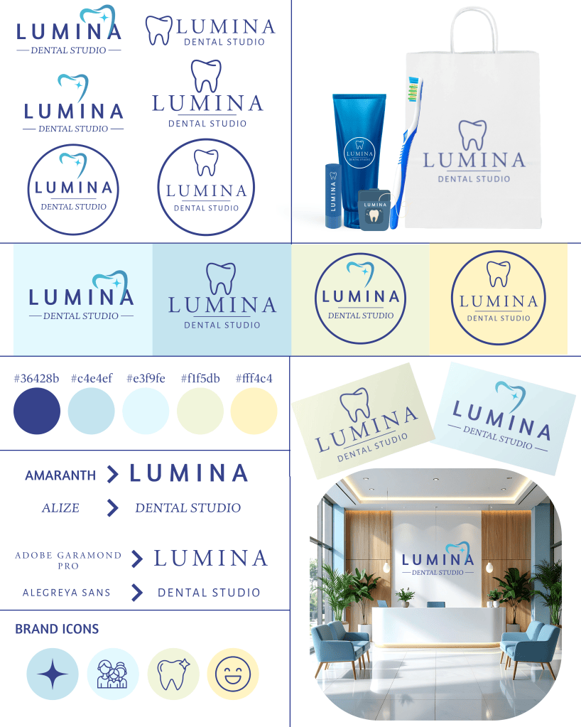
Lumina Dental Studio — Full Brand Identity
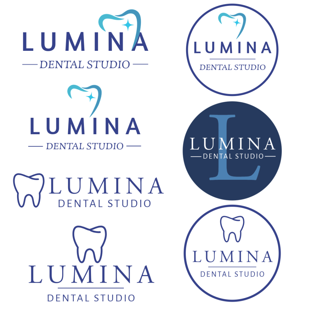
A complete brand system built for a modern dental studio, designed to feel clinical and trustworthy without losing warmth. I started with the logo itself, developing multiple lockup variations (wordmark only, icon plus wordmark, a circular badge version) so the brand has flexibility across different applications, from a small social icon to signage on a physical wall. The tooth-and-sparkle mark was intentionally simplified to two line-weight options, one softer and illustrative, one more structured and outlined, so the practice could lean playful for family-facing content or refined for more clinical materials, without ever feeling like two different brands. Color was one of the biggest decisions here: I chose a cool navy paired with soft pastel blues and a touch of warm yellow specifically to avoid the sterile, cold feeling dental branding can fall into, while still reading as clean and modern. I carried the system through packaging, signage, and an interior mockup to prove the identity actually holds up in a real environment, not just on a logo sheet.

Lash & Luxe Beauty Studio — Full Brand Identity
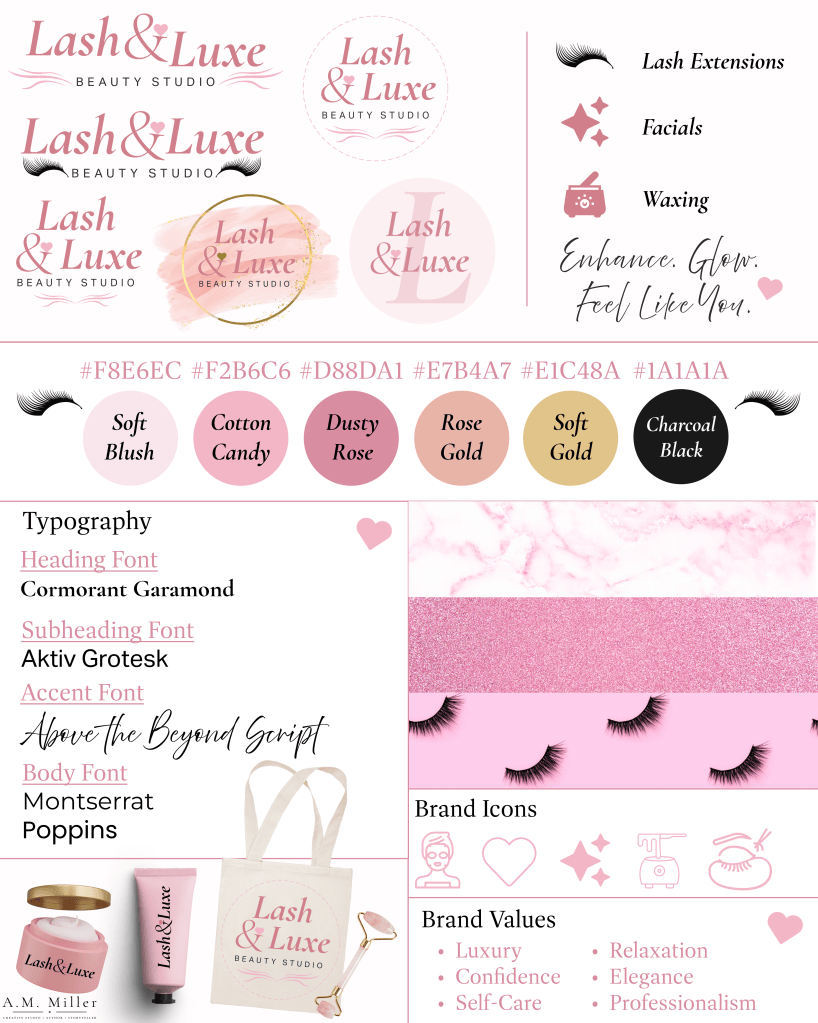
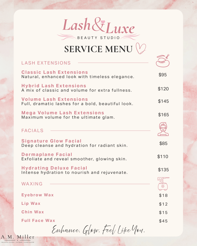
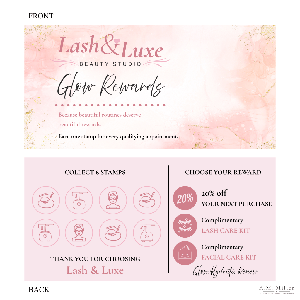
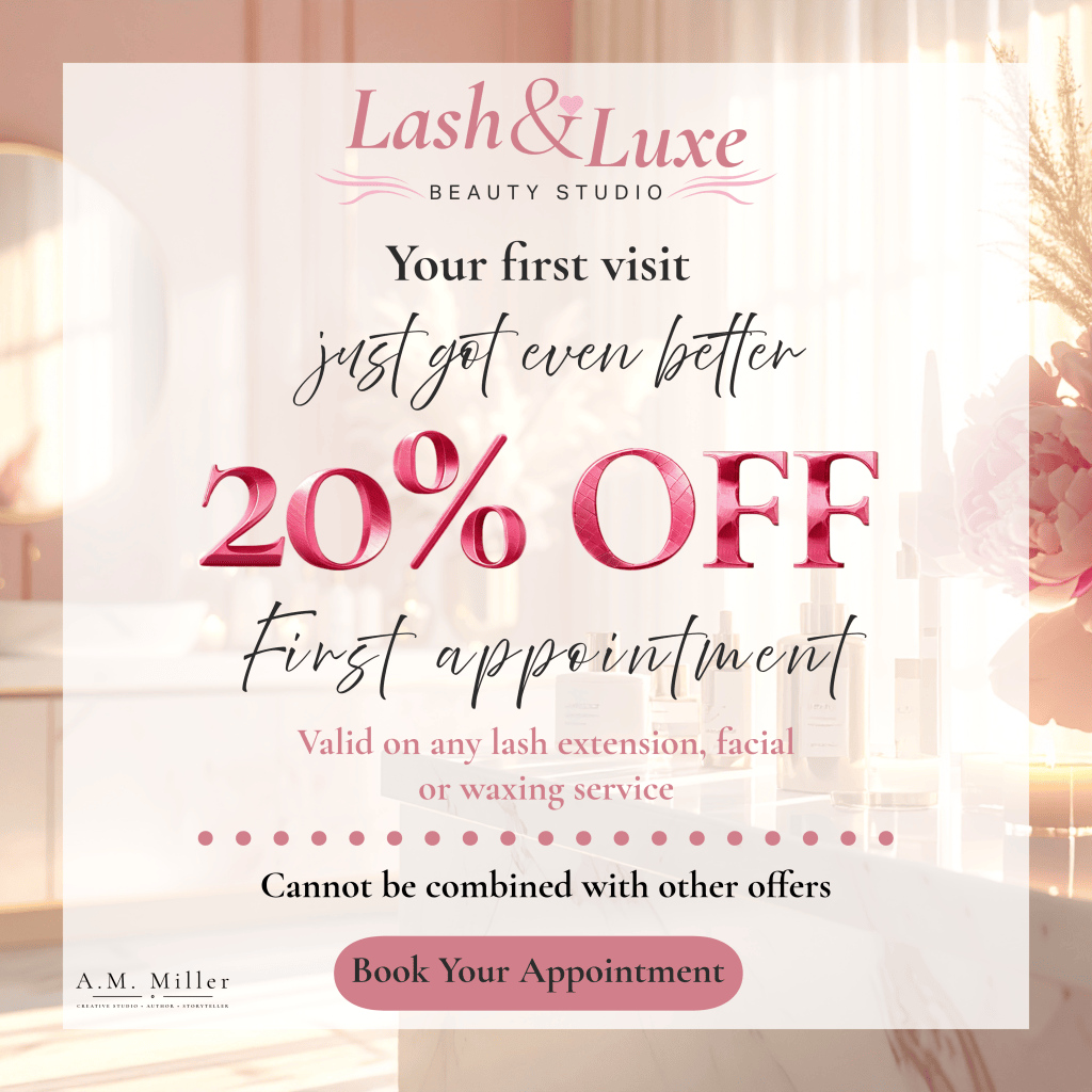
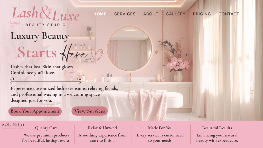
A luxury beauty brand identity built for a lash extension and skincare studio, designed to feel elegant and indulgent while still staying warm and approachable rather than cold or unattainable. I developed several logo variations here, a full script wordmark, a circular badge version, a gold foil watercolor treatment, and a simplified monogram using just the “L,” so the brand has a mark that scales gracefully from a small product label all the way up to signage without losing its personality at any size. The six-color palette (soft blush, cotton candy, dusty rose, rose gold, soft gold, and charcoal black) was chosen to feel timelessly upscale rather than trend-driven pastel, giving the brand longevity beyond a single season of beauty trends. Typography needed to carry the same balance: I paired an elegant serif (Cormorant Garamond) for headings with a clean sans-serif (Aktiv Grotesk) for structure, a flowing script (Above the Beyond) for accents, and Montserrat and Poppins for body copy, so the system reads as polished at every level of hierarchy. I carried the identity through product mockups (a skincare jar, hand cream tube, and canvas tote) and a custom icon set built specifically around the studio’s actual services, facials, waxing, lash extensions, rather than generic beauty icons, to prove the brand holds together across real physical touchpoints, not just on a logo sheet.
The Rusty Rail — Full Brand Identity
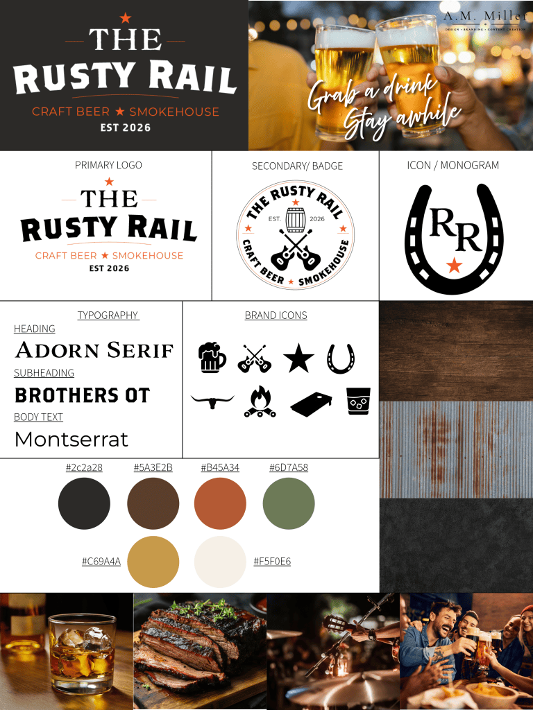
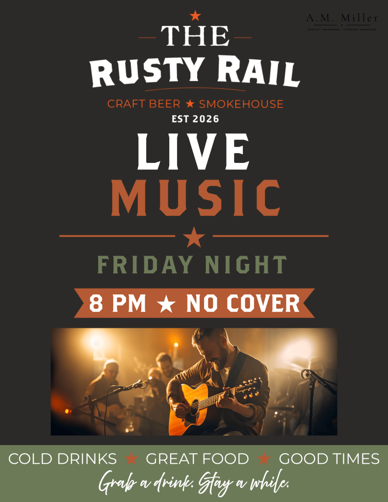
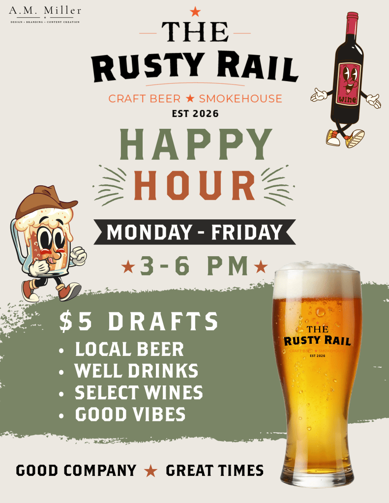
A three-piece set showing a brand identity in action, from the full system down to real-world promotional use. The identity itself uses a bold, western-inspired wordmark alongside a circular badge logo and horseshoe monogram, paired with a rough heading font and clean body type to strike a rustic-but-legible balance, and a custom icon set (beer mug, longhorn, cornhole board, campfire) built specifically for this concept rather than pulled from a generic pack. The two flyers put that system to the test: the Live Music flyer needed to feel high-energy and event-specific while staying instantly recognizable as the same brand, so I kept the color palette and badge logo consistent but let the live photography and bold event details carry the excitement. The Happy Hour flyer took a different approach entirely, introducing custom mascot-style illustrated characters (a walking beer mug, a dancing wine bottle) to give the promotion a more playful, scroll-stopping personality, while the typography, color story, and glassware branding still tie it firmly back to the core identity. Together, these three pieces show how a single brand system can stretch across a formal identity board and two very different promotional tones without ever feeling disconnected.
Wildflower Bakery — Full Brand Identity
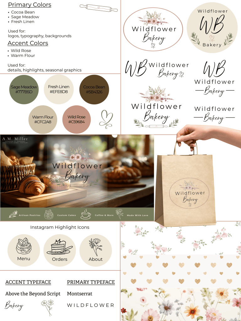
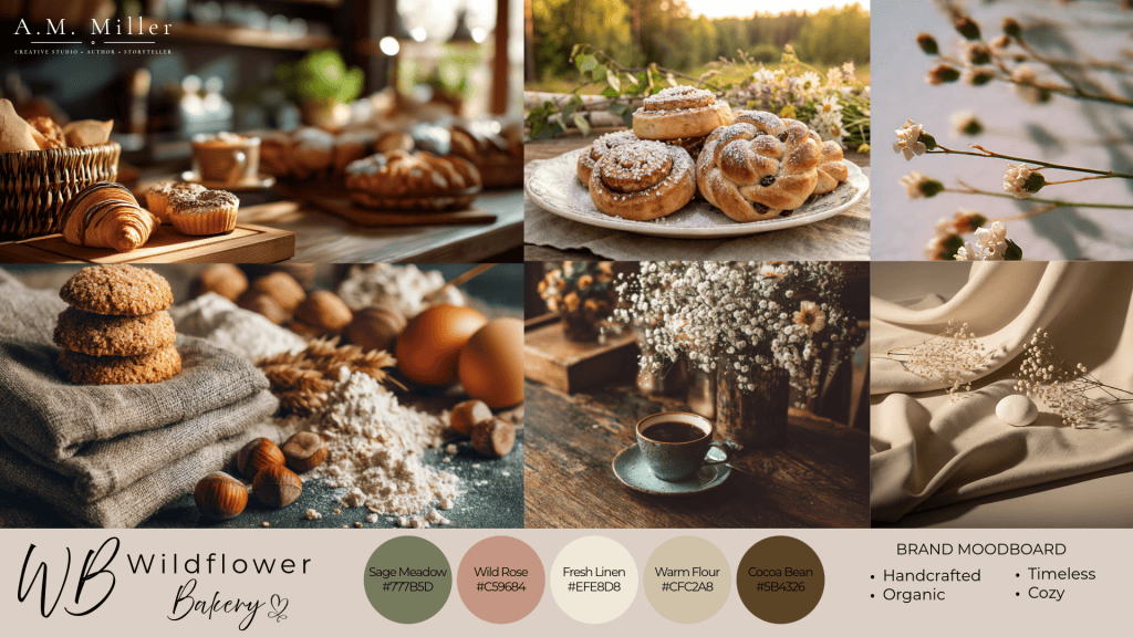
A soft, botanical brand identity built for an artisan bakery, developed around the idea that the visuals should feel as warm and handmade as the product itself. I built a full moodboard first, pulling texture references like flour, linen, fresh pastries, and wildflowers, before touching the logo, since I wanted the color palette and typographic feel to come from the product and atmosphere rather than the other way around. The primary logo pairs a delicate floral illustration with a soft script for “Bakery” against a clean serif for “Wildflower,” giving the mark a balance of elegance and approachability that works whether it’s stamped on a kraft paper bag or printed small on a business card, and I developed several simplified variations (a monogram “WB,” script-only, line-only) so the identity has flexibility across different applications. The sage, wild rose, and warm flour color palette was kept intentionally muted rather than trend-driven pastel, so the brand feels timeless and still looks right well beyond a single season.
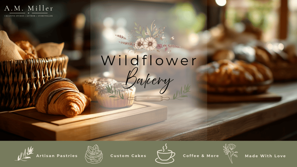
I carried the system into a website homepage design, layering the logo and script wordmark over real bakery photography with a clean service bar underneath (Artisan Pastries, Custom Cakes, Coffee & More, Made With Love), to prove the identity works as a full digital presence, not just a logo file. I also designed a set of Instagram highlight icons and a seasonal promotional graphic for a new menu item, showing how the brand extends naturally into ongoing content, not just a one-time launch.
Social & Marketing Graphics
Single-piece social content and promotional graphics built within established or newly developed brand systems.
Fiz & Sip Soda Co. — Product Launch & Menu Graphics
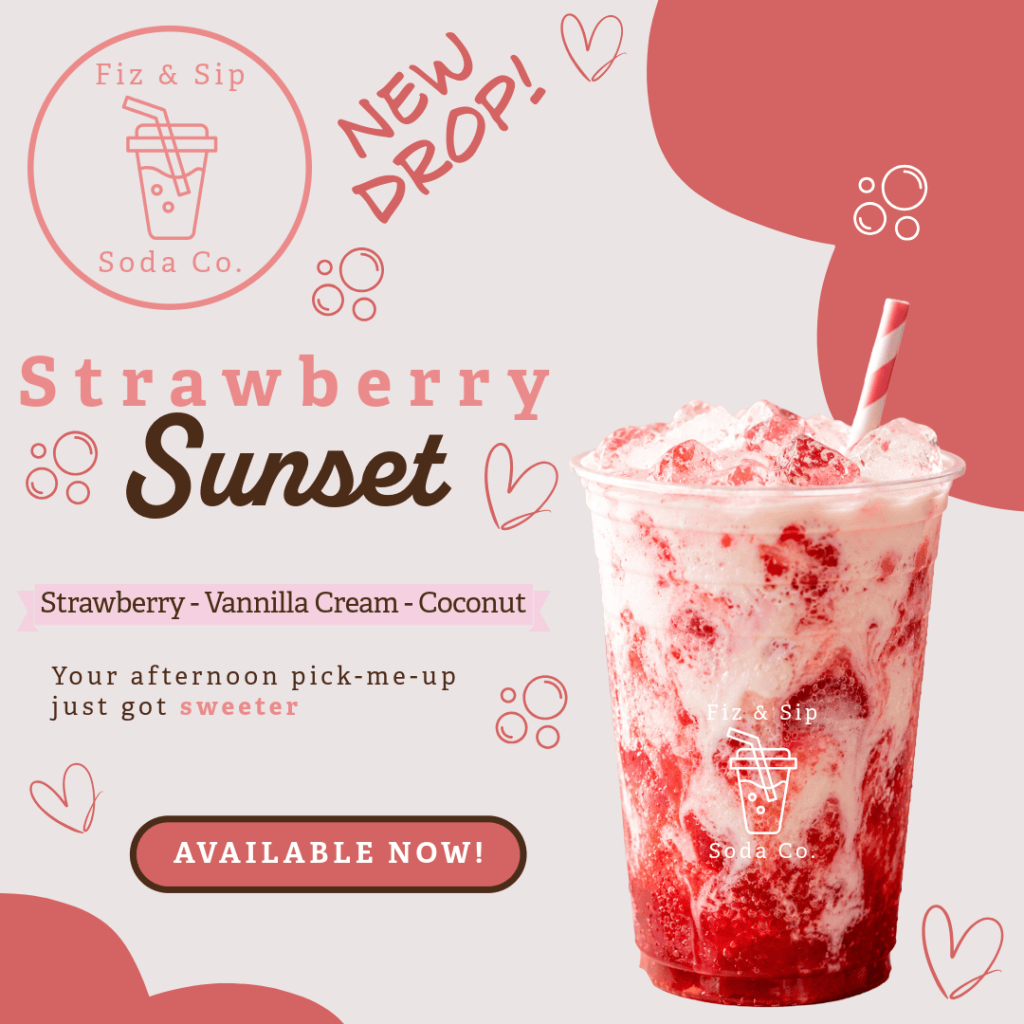
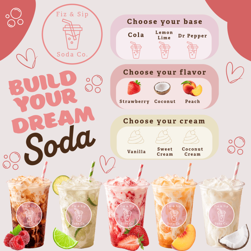
Two connected social graphics designed for a build-your-own soda concept, created to show how a single brand identity can flex across different content purposes. The Strawberry Sunset graphic is a product spotlight, built to announce a limited-time flavor drop, so I leaned into bold, saturated food photography and a punchy “New Drop!” callout to create urgency and make the drink itself the hero of the composition. The Build Your Dream Soda graphic serves a completely different function: rather than promoting one product, it’s an educational menu piece, breaking down the customization process (base, flavor, cream) into clearly separated visual categories so a customer can understand the ordering system at a glance. Keeping both pieces cohesive required carrying the same color story, rounded typography, and playful line-art bubbles across two very different layouts, one image-forward and emotional, one information-forward and structured, while still reading as the same brand.
Sage & Bloom Boutique — Fall Collection Promo
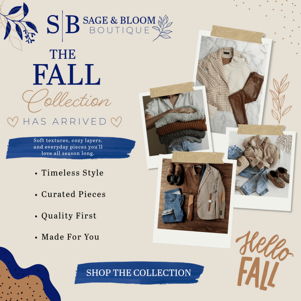
A seasonal social graphic built around cozy flat-lay photography, using a warm neutral palette and mixed typography (bold serif, script, and hand-lettered accents) to capture an autumn boutique feel.
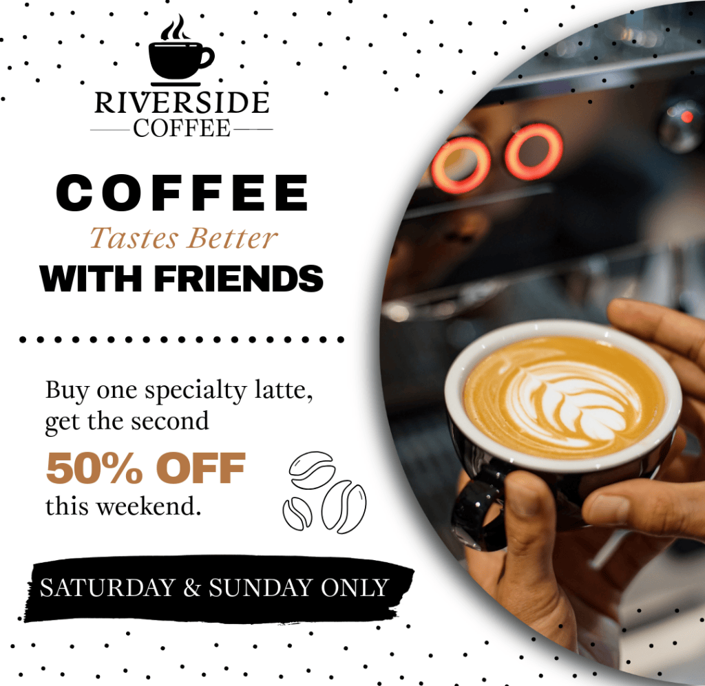
Riverside Coffee — Weekend Promo
A bold, high-contrast promotional graphic for a limited-time weekend deal, pairing black-and-white typography with a warm accent color and a circular photo crop to keep the offer front and center.
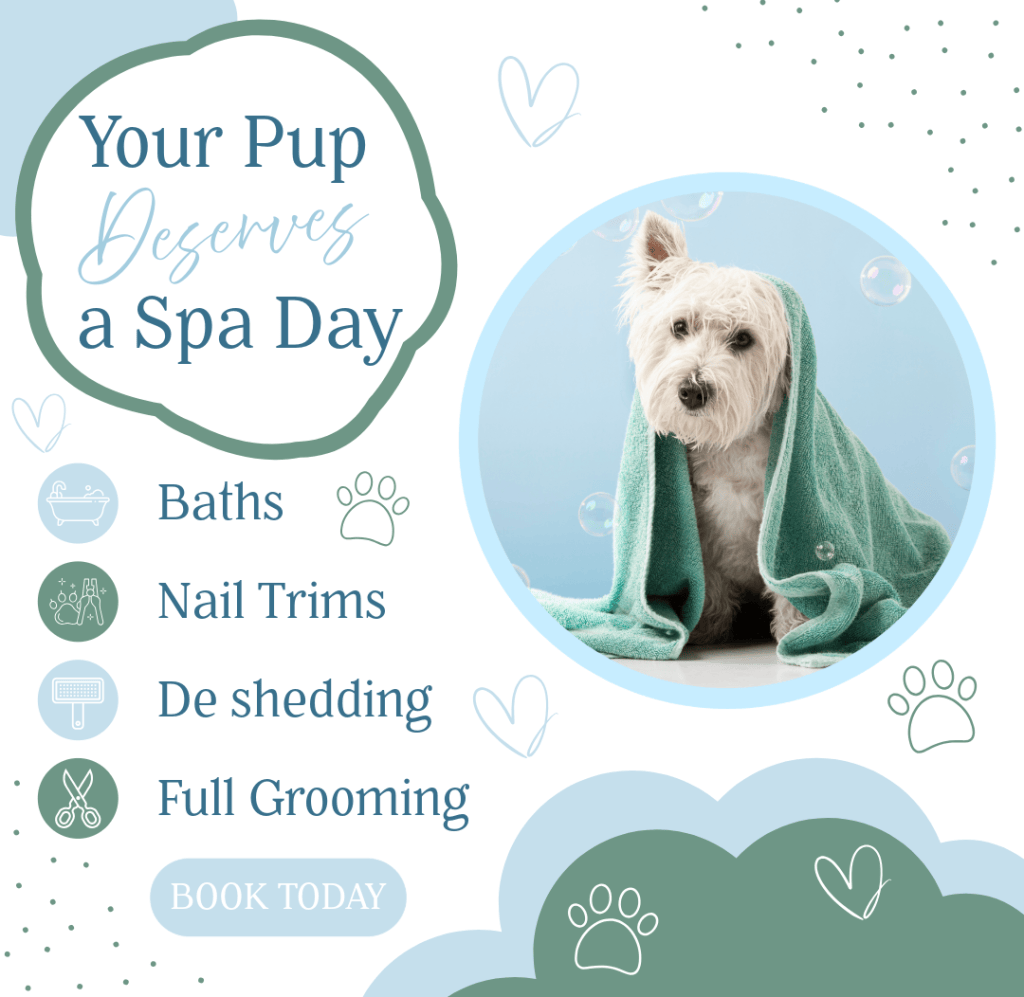
Pet Grooming Spa Day Promo
A playful, soft-toned social graphic for a pet grooming service, using hand-drawn hearts and paw prints alongside a candid pet photo to create a warm, approachable feel around the service list.
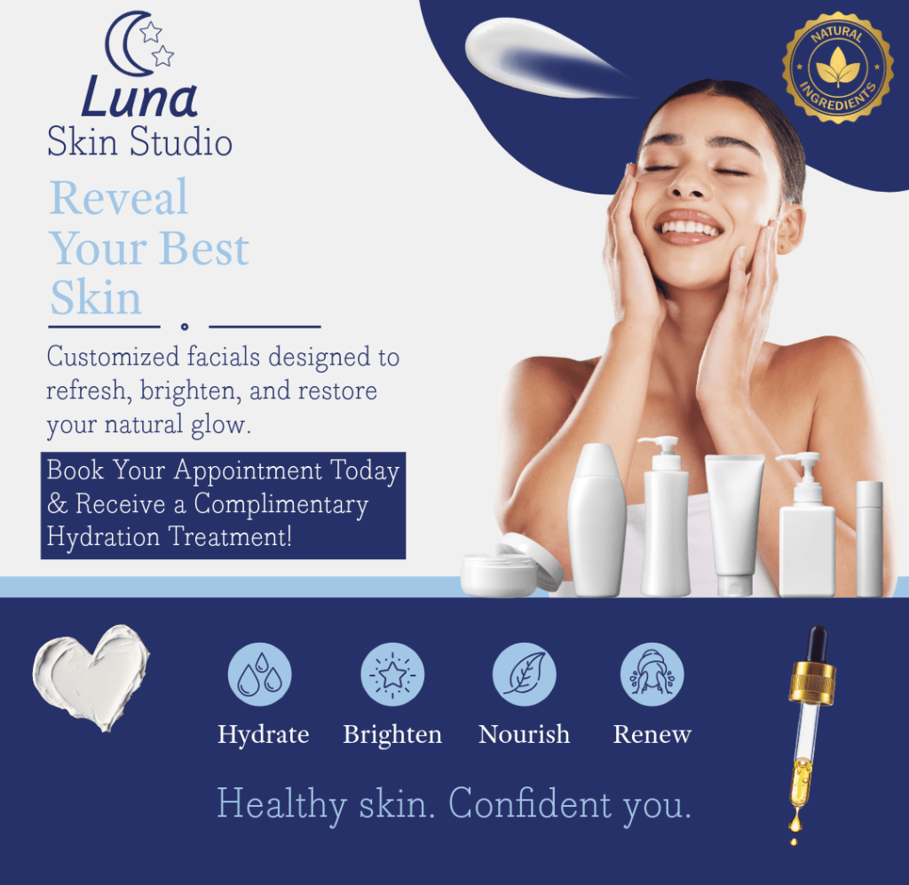
Luna Skin Studio — Service Promo
A clean, elegant social graphic promoting a facial service, pairing soft product photography with a deep navy and gold color palette to feel premium and spa-like while keeping the offer easy to read at a glance.
Book Covers & Release Campaigns
Bad Idea — Full Cover Design & Social Media Promotions
A complete design package for a neon-soaked contemporary romance, built to show how one cover concept extends into a full launch campaign rather than existing as a single static image. The full wrap cover establishes the visual language: a custom illustrated helmeted rider, bold sticker-style typography, and a hot pink and cyan neon palette that reads as fun and a little rebellious while still staying legible at thumbnail size. From there, I built out the social promotional pieces to carry that same identity into different marketing moments.
The cover reveal graphic uses a 3D book mockup and a pull-quote callout to announce the release and give readers a taste of the book’s voice before it’s even available. A second quote graphic pulls a specific line (“Opening that message was my first mistake…”) into its own neon-framed design, giving the author a shareable, stylized piece built around the writing itself rather than just the cover art. A trope checklist graphic rounds out the set, translating genre-specific reader interests (wrong number romance, masked rider, forbidden attraction) into a scannable, checkbox-style format, since romance readers often shop by trope and this gives them a fast, visual way to self-select into the book. Together, these pieces show my approach to book marketing as a full system: one core aesthetic, adapted intentionally across formats to serve different points in a release timeline.
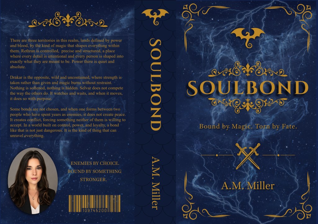
Soulbond — Book Cover & Launch Assets
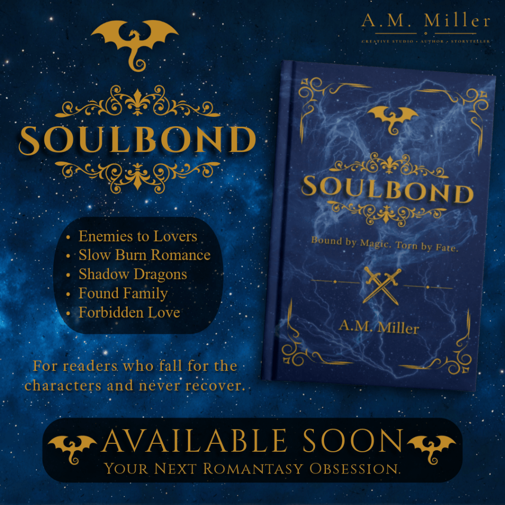
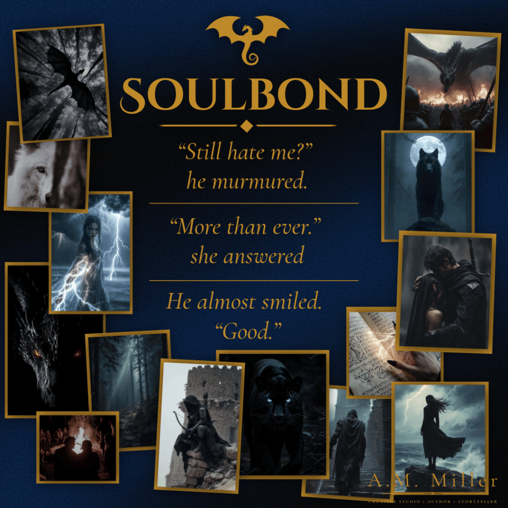
A cover, moodboard, and teaser graphic for a dark romantasy, built in Adobe Express as one connected system rather than three separate designs. I started with a moodboard, pulling reference imagery around the book’s core pillars — shadow dragons, a wolf and panther for the loyalty thread, lightning and storm figures for the “torn by fate” tension, cloaked figures on castle ruins for the territorial conflict — to lock the palette (deep navy and aged gold) and tone before touching the cover itself. The full wrap cover layers a lightning-and-smoke texture over a starfield base for depth, framed with gold scrollwork and a dragon glyph carried across front, spine, and back; the back copy is split into three short worldbuilding paragraphs to stay scannable in a bookstore or thumbnail, with the author photo and pull-line placed to feel native to the layout rather than bolted on. The teaser graphic reuses that same key art rather than introducing a new composition, angled and drop-shadowed for dimension, with a trope list added since romantasy readers browse by trope, and an “Available Soon” banner to turn the scroll-stop into a follow or pre-order.
Night of the Fallen — Full Wrap Cover & Reveal Graphic
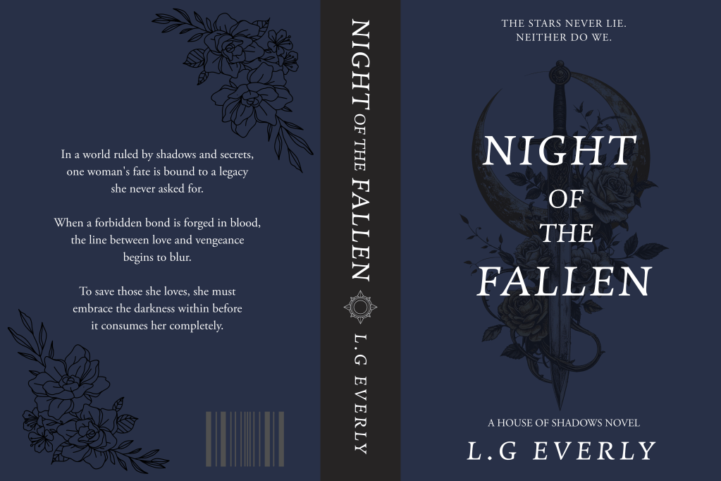
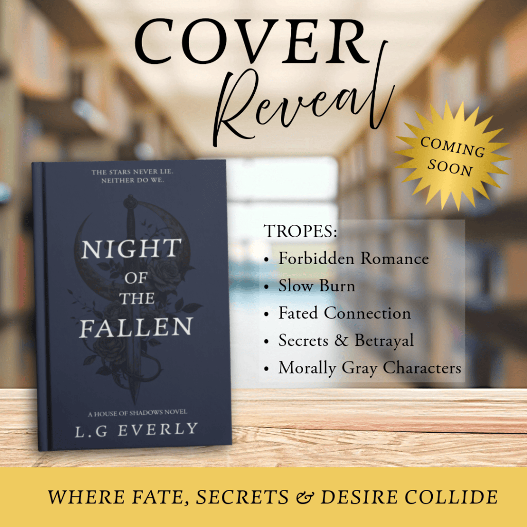
A full wrap cover for a dark romantasy, built around a hand-illustrated dagger-through-crescent-moon motif with rose linework in place of a photographic background, since a flat navy field with fine linework reads more literary/gothic than the starfield-and-lightning treatment I’d use for a higher-fantasy title. I kept the palette to a single deep navy with white and grey type for contrast, floral line-art in the corners for texture without competing with the dagger centerpiece, and a compass/sun emblem on the spine to tie front and back together; the back copy is three one-sentence beats rather than full paragraphs, each escalating the stakes (bound fate, forbidden bond, darkness she must embrace), so it reads almost like jacket-copy poetry instead of a synopsis. From there I built the reveal graphic by dropping the finished cover into a blurred bookstore/library photo to sell the “on shelves soon” fantasy, pairing a serif “COVER” with a script “Reveal” for contrast, and swapping in genre-specific language (forbidden romance, fated connection, morally gray characters) with a gold starburst “Coming Soon” badge and a bottom banner line to close the announcement.
A Note on Process
Every piece in this portfolio was created using a combination of Adobe Express, Canva, and Adobe Illustrator. I believe good design comes from understanding color, typography, and composition, not from any single tool, and I enjoy working across platforms to find the right fit for each project’s needs.
Thank you for taking the time to look through my work. If you’d like to talk further, or see anything not shown here, I’d love to connect.
 Miller-Portfolio